
THE PROBLEM: Inconsistency
2020 brought some monumental change to the Bread team and we wanted to rebuild the website to reflect the massive milestones we’d accomplished. Not only did the new look need to emphasize a more tech-forward aesthetic, but it also needed to be cohesive and clearly bring together all of our brand’s audiences under one umbrella. The voice and tone needed to ride the fine line between consumer-friendly and also cater to our enterprise and merchant base that knows us as a technology platform.


THE SOLUTION: Cohesion
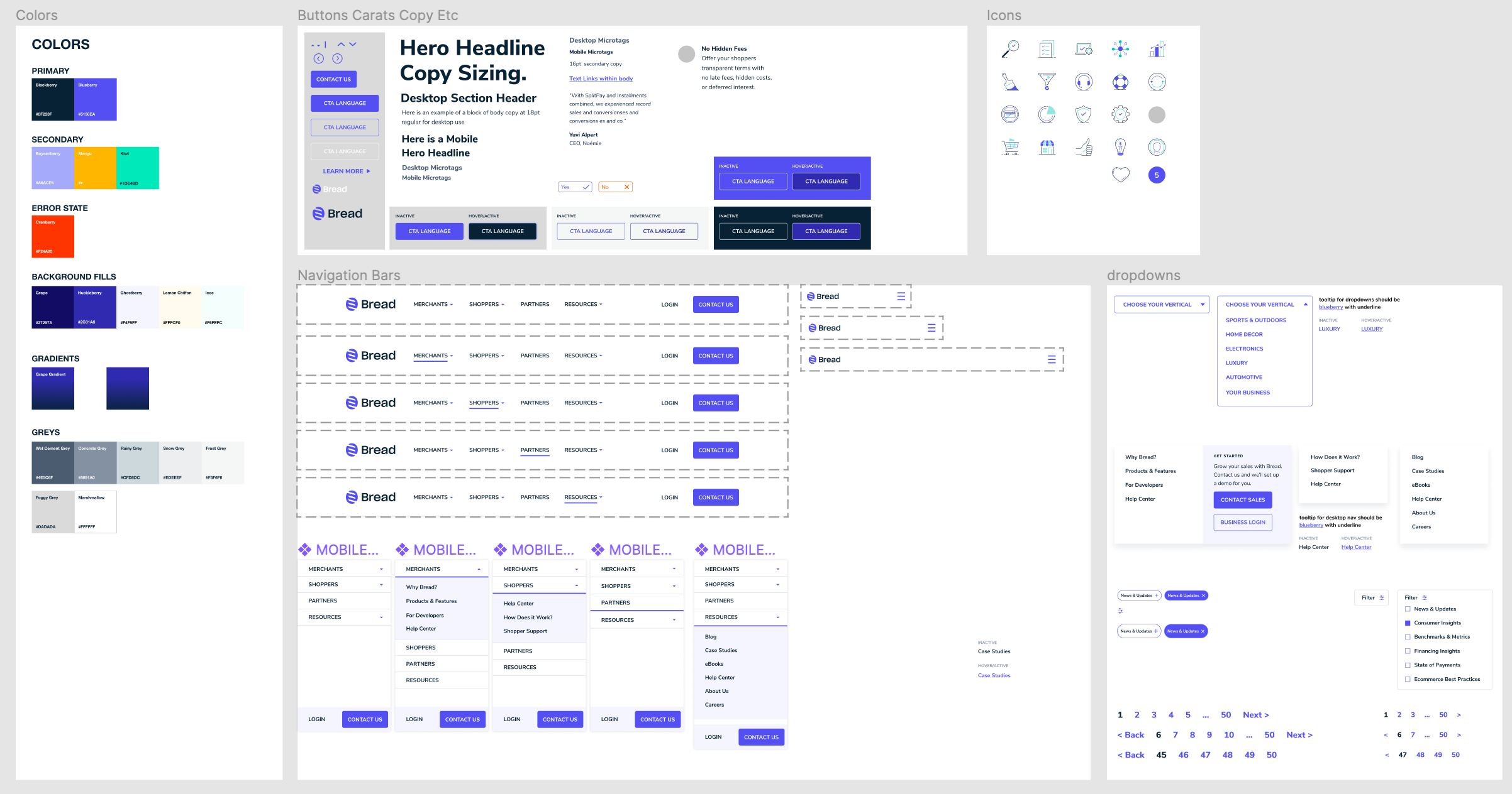
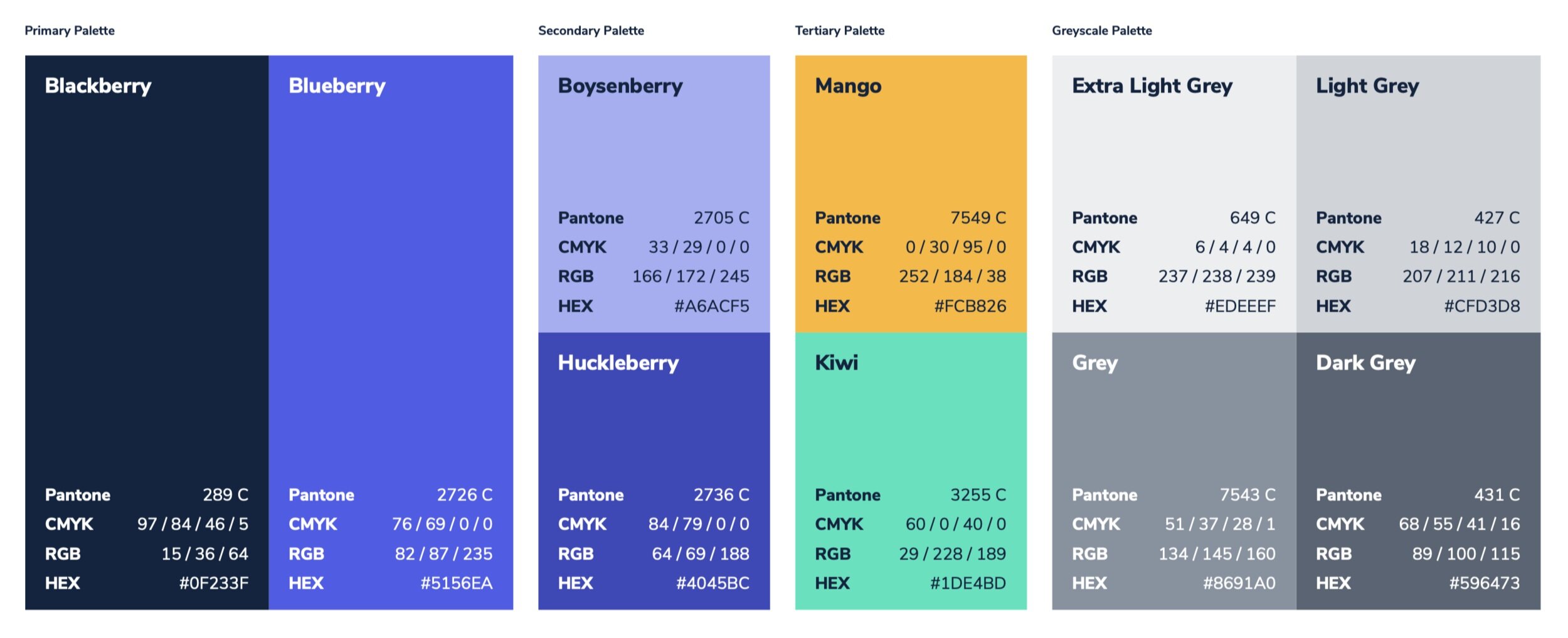
We moved away from stock photography and instead took the artwork in-house to keep things feeling uniquely “Bread” centric, and also incorporated more colors into the traditionally monochromatic color palette. We solved the issue of inconsistent branding while maintaining a unique feel for each audience by utilizing colors as a way to weave a broader brand story throughout the website experience, as well as help guide visitors to understand what section of our website they were currently exploring.


Illustrations, Icons, Components, Colors, and more
In addition to overhauling the website, we took special care to consider the brand’s existing illustrations and marketing collateral and made the move to update all graphics to coordinate with the rebrand to keep things feeling bright, cohesive, and tech-forward.